← All work{{ clock }}

About Thanvi Nimmala
I’m a product designer based in the NYC metropolitan area. I like making design feel fun and useful, and I build the thing rather than a picture of it.
I graduated in 2026 with a B.A. in Information Technology & Informatics, and a minor in Digital Communication, Information & Media.
Since then I have been Product Design Lead on New Craft Society at CoCreate, where I took a capture tool from nothing to a public beta. I work end to end — research, flows, interface, design systems — and prototype in React and SwiftUI, so a decision can be tried instead of argued about.
I’m currently looking for full-time design work.
Outside of design I am usually painting, reading, or chasing a good playlist.
← All work{{ clock }}
A tool that makes your design process visible.
New Craft Society is a macOS capture tool and a web product that turns the work as it happens into a story you can hand to someone. I led design 0→1 at CoCreate, and owned the capture tool and the landing page end to end.
Overview
How might we capture work in progress with so little friction that the case study almost writes itself?
Designers lose everything that led to a finished piece. The work is scattered across Figma, chat threads and a hundred tabs, and by the time a case study is due you are doing archaeology on your own project.
CoCreate is a design platform for early-career designers. New Craft Society is its newest vertical: a capture tool that stores the work as it happens, and a web product that reads it back as a process you can show someone.
The product end to end, from its opening sequence through to a project open inside it.
Solutions
Two halves of one product, and the one I owned end to end.
Capture had to cost nothing at the moment it happens, and the return trip had to be worth scrolling. The capture tool was mine end to end; the web product that reads it back was team-led.
CAPTURE — MINE, END TO END
⌘⇧2 stores the capture before anything appears on screen. What appears afterwards is a receipt, not a gate: it states what happened and asks for nothing. The AI works after the fact, and never blocks the moment.
The shipped capture tool, uncut — the hotkey, the receipt, and the summary arriving later.
THE TIMELINE — TEAM-LED
Everything captured comes back as one continuous stream per project, read chronologically, so you can scroll back through every iteration without having decided in advance which versions were worth keeping.
Research
Designers were already using tools that were not built for this.
Thirty-plus designers, across skill levels. The sharpest answer came from Hana, an interaction design student applying for product internships. I asked how she would feel about a tool that let her show work in progress to other people.
“I already do that in Medium. I write blogs and upload screenshots to document my process. I don’t think I’ll need it.”
Hana — junior in interaction design, ArtCenter.
THE INSIGHT
Designers are missing a lightweight work-in-progress layer between raw files and a polished portfolio.
Her portfolio felt too final, so she blogged instead. That is a workaround, not a preference — and it told us what to build: a tool, not a social network. Something faster than writing a doc, that shows progress over time, and stays useful even if nobody else ever sees it.
SHARED WITH ONE TEAMMATE
Process
I designed something beautiful, then cut it for being in the way.
The capture card is the surface someone sees fifty times a day, so it got the most craft and the most ruthless editing. I built four versions rough and fast — solid enough to test, cheap enough to throw away. Each answered the same question: how little can the tool ask for at the moment of capture?
01
The full card
Thumbnail, filed process, an optional note, and four actions — save, reassign, new project, dismiss. Every decision available in the moment.
Why it lost. Four words in the dogfood review ended it: too intrusive, too complex. It had grown into a form parked in the middle of someone’s work, waiting for input.
02
Note first
“Add a thought” — the capture behind a text field, with keyboard shortcuts for filing and a confidence badge for where it would go.
Why it lost. A blank field is still a demand. It asked for words at the one moment you have none, and the shortcuts only helped people who had already learned them.
03
The pill
A small persistent counter that tallied captures as they happened, with nothing to fill in.
Why it lost. It moved the question from “what do I write” to “is it on” — a permanent presence on screen that had to be looked at to be trusted.
04
The receipt
The capture is stored first. A receipt appears afterwards, states what happened, and asks for nothing. Organising moves to a moment when the person has attention to spare.
Why it shipped. It was the only version that cost nothing at the moment of capture, and the only one people kept using after the session ended.
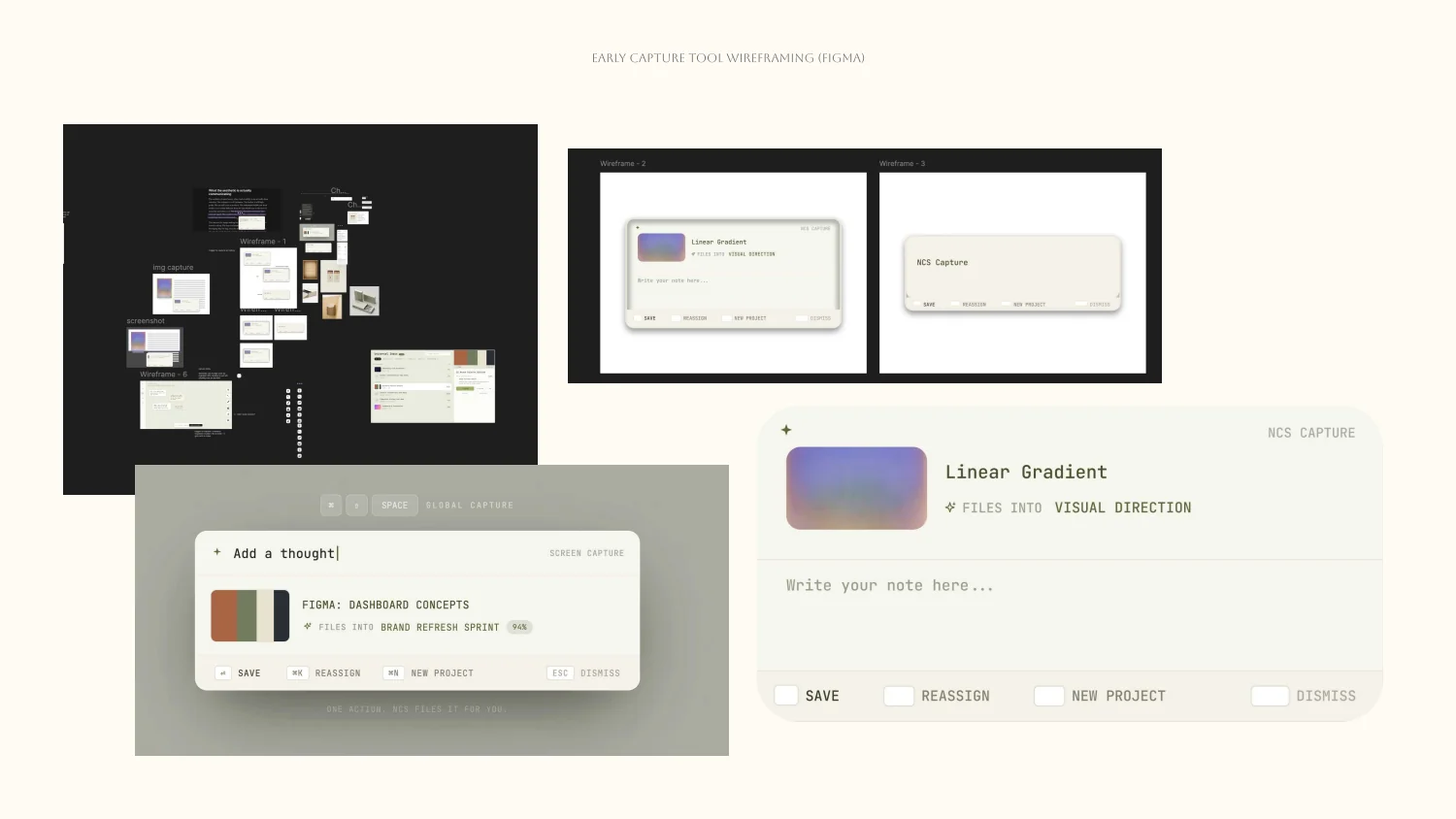
The versions on paper.
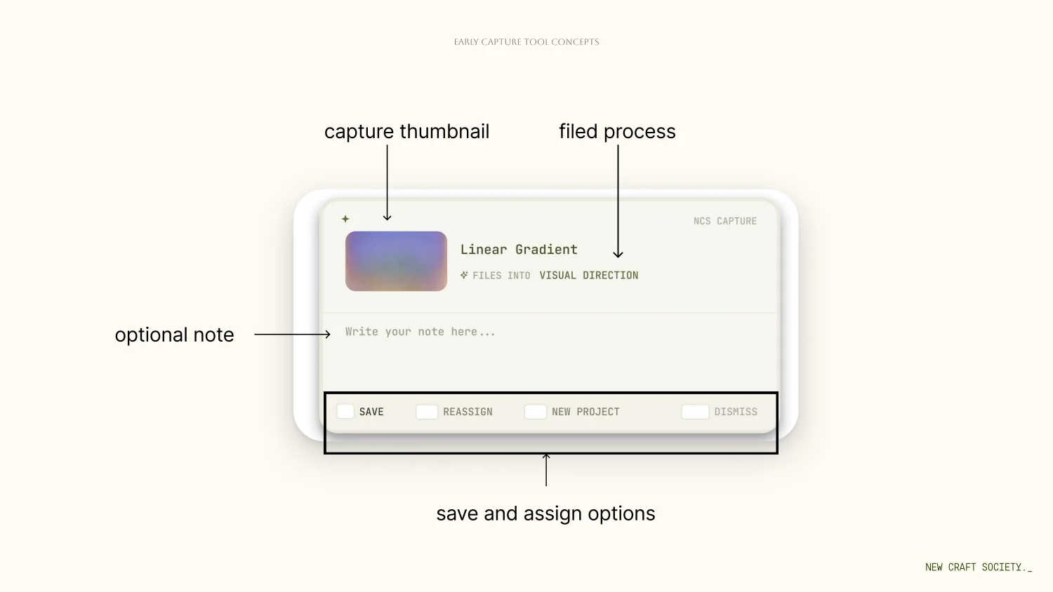
Version 01, annotated — every option in the moment.
MINE, END TO END
Landing page
The page had to explain capture to someone who had never seen it.
People download the tool and are thrown straight into their own work, so the page carries all of the explaining. Mine end to end — structure, copy, interface and build.
The page as it shipped, top to bottom.
SHOW BEFORE TELL
The product is hard to describe and instant to understand, so the page opens by demonstrating a capture rather than explaining one. Five sections, each with one job.
01
The hero
Two ways in — download the capture tool, or open the web app.
02
The demo
Show, don’t tell. A simulation of what the tool feels like to use, before a single line of explanation.
03
The mechanic
How to use the capture tool, in the fewest instructions possible.
04
Capture types
Every kind of capture the tool supports, proactive and ambient.
05
The payoff
What a collected process turns out to be good for — the use cases, last, once you already want it.
02 — the demo.
03 — the mechanic.
04 — capture types.
05 — the payoff.
MINE, END TO END
Engineering
Prototyping in code turned sprints into days.
Before, an alternative meant a Figma clickthrough — wired screen by screen, evaluated a sprint at a time. With AI-assisted code I built each one as a working prototype in React or SwiftUI instead, so the team could use the thing rather than click through a picture of it.
The team evaluated concepts in days rather than sprints, before any engineering time was committed. The design decisions stayed the slow part, which is the right thing to be slow about.
The alternatives running as working prototypes.
Validation
Research took our most ambitious feature off the roadmap.
Auto capture — the AI deciding what to keep, with no trigger from you — started as a P0, and was the most ambitious thing we had. The internal assumption was clean: remove documentation friction entirely and it becomes the product’s killer advantage.
Across thirty-plus sessions, four questions came back that we could not answer: what would it capture, when would it start, who stays in control, and is it actually useful? Auto capture came off P0 and went back to exploration. Trust and onboarding took its place.
30+
Test sessions run and documented.
100+
Beta signups before launch.
30→50%
Share was used by 30% of users in V1. The redesign is measured against 50%.
THE METRIC I ARGUED FOR
How many times has someone scrolled to the bottom — not just how long they stayed on the page.
SHARED WITH ONE TEAMMATE
Reflection
What I would do differently.
1
Put the rough versions in front of people before the polish.
The working prototypes are what made evaluation cheap, and they came after the craft. I spent weeks refining a card that four words in a review removed. Next time the rough ones go out first and the craft goes into whichever survives.
2
Treat the most ambitious feature as a research question, not a roadmap item.
Auto capture sat at P0 on an internal assumption for most of the project. The four questions that took it off could have been asked in week one.
3
The half still being tested is the return trip.
The honest version of this page is that the capture problem is solved and the memory problem is not, yet — making a timeline you would actually scroll to the bottom of, and turning that scroll into the case study it promised to write for you.
Up next
The rest of the work.
← All work{{ clock }}
Food delivery, pointed at food insecurity.
EcoBites borrows the most familiar pattern in modern life — the food-delivery app — and points it at New Jersey’s food banks, pantries and kitchens. A client website for people who need food, and an iOS app for the volunteers who drive it there.
Overview
How do you get good food to people without making them prove they deserve it?
Food insecurity is rarely a lack of food. It is a lack of access. Pantries, soup kitchens and food banks already hold what people need, but the network around them is fragmented, hard to navigate, and easy to fall through.
So the whole product had to be ordinary: open the site, see what is available nearby right now, reserve it — free — and choose delivery or pickup. No payment, no paperwork, no queue.
Reserving a box — the whole run, recorded from the prototype.
Solutions
Two apps sharing one live order.
The instant a request is placed it surfaces as an open route in every nearby driver’s app, and every step the driver takes flows straight back to the person waiting at home.
THE CLIENT FLOW
Browse by category, open a listing, reserve it, then choose delivery or pickup. Five screens, plain language, and reassurance on every one of them.
Filtering by diet and fulfillment — narrowed past what exists, then widened back.
THE HANDOFF
One order, two live views. The cargo check is the only step that cannot be skipped — it is what makes the handoff accountable.
One order across both surfaces — placed on the left, accepted on the right.
THE DRIVER FLOW
Claim a route, verify every box against the order before it leaves the pantry, drive it to the door. Every status the driver sets lands back on the client’s tracker in real time.
The run, in motion.
Research
1.2 million New Jerseyans, and a network they cannot see.
We worked with the Community Food Bank of New Jersey as our stakeholder, and grounded the market research in existing relief programs — among them the White House Conference on Hunger, Nutrition and Health, and Project DASH.
The statewide figure is Feeding America’s Map the Meal Gap estimate for New Jersey in 2024: 13% of the state, up from 7.4% in 2020.
1.2M
New Jerseyans facing food insecurity.
4
Actors in a single order.
2
Apps sharing one live order.
THE INSIGHT
Dignity is a design requirement, not a tone of voice.
Every word, every wait state, every empty screen had to reassure rather than gatekeep. That is what decided the copy, the tap targets and the contrast long before it decided the visuals.
Process
Four moves, from a messy problem to a calm flow.
Map the real network — banks, pantries, kitchens, and the routes food already travels between them. Reframe delivery as a two-sided service: recipients request, volunteers and partners fulfil. Prioritise first-run, browse-by-need and order-tracking so a stressed first-time user can move without friction. Then build a warm, legible component set around them.
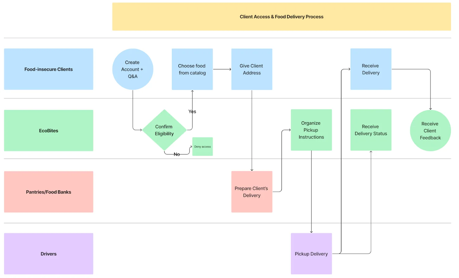
The same order traced across all four actors, from account creation and eligibility through pickup, delivery and feedback. This is the diagram that showed us the second app was unavoidable.
Trade-offs
It started as a waitlist. It became a delivery network.
The first version let people register on waitlists at participating pantries and coordinated surplus food out to them. The waitlist made the provider the unit of the product — you joined a queue at a place.
The reservation makes the meal the unit, and that is what forced the second app: once someone can claim a specific bag of food, someone has to move it.
01
How you get food
Register on a waitlist at a participating provider.
Where it landed. Reserve what is on the shelf right now.
02
When you find out
When your turn comes up.
Where it landed. Immediately, with live tracking.
03
Who moves it
Coordinated distribution.
Where it landed. A nearby volunteer claims the route.
The prototype
Two surfaces on one order, with no backend behind them.
Fourteen screens — seven on the client website, seven in the driver app — built as a React shell that both surfaces drive from a single store. A delivery placed on the website appears as an open route on the phone, and the driver’s progress moves the client’s tracking timeline. That handoff is the whole argument, so the default view shows both at once.
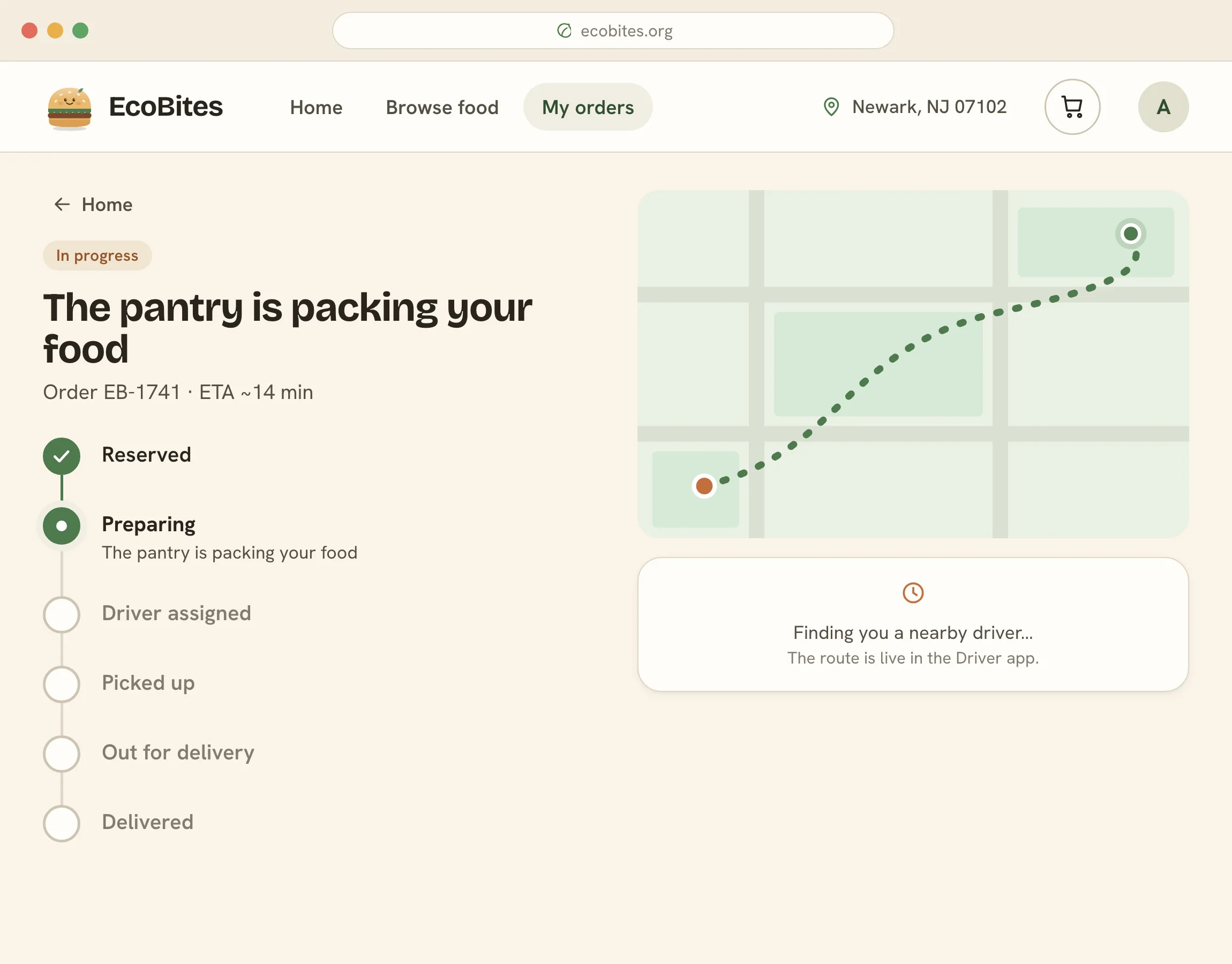
The client’s tracker…
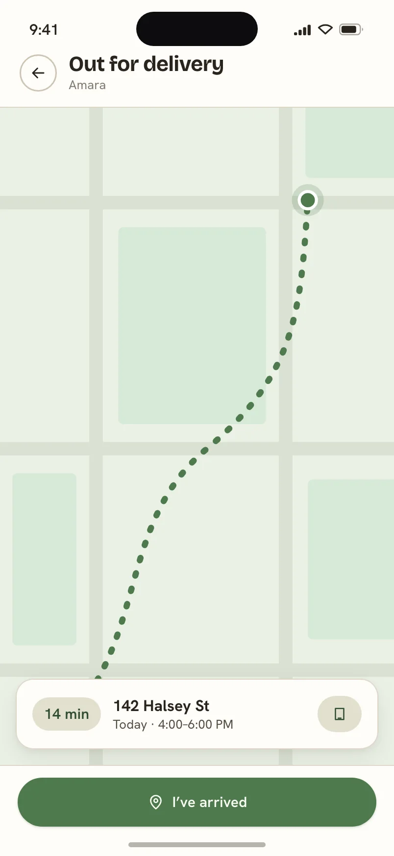
…and the screen that moves it.
BUILT TO BE DRIVEN, NOT CLICKED THROUGH
01
A scene rail, grouped by surface
Every screen worth putting in a deck is one key away, and picking a scene fabricates exactly as much order history as that screen needs — an empty pantry, a route mid-run, a delivered box.
02
Design controls both surfaces read
Primary, accent, display face, corner radius and photography on or off. Each writes a CSS custom property that the website and the phone app both read, so retheming the system is one panel, not two files.
03
Reels that drive the real interface
A synthetic pointer clicks real targets in the running app rather than replaying a recording, so what you watch is the product working. Seven of them, including the one that traces a single order across both surfaces.
04
A capture mode
Record mode hides the rail and the panel; a query parameter renders any single surface alone at its natural size, with the order history already built. Every still and reel on this page came out of it.
Reflection
What I would do differently.
1
Pilot it with one county before designing for a state.
The model is sound on paper and untested in a pantry. A single county’s network would tell us in a fortnight what a semester of desk research could not.
2
Design the volunteer-side tooling that makes the model actually run.
We designed for the driver in the car. We did not design for the coordinator deciding which routes exist — and that is the role the whole thing depends on.
3
Test the words with people who have used a pantry.
Dignity was our principle, but we were the ones deciding which sentences cleared it.
3
Resource types unified into one request flow.
1 tap
From opening the site to the nearest open pantry.
WCAG AA
Large targets, plain language, high contrast.
Up next
The rest of the work.
← All work{{ clock }}
An exhibition that could only exist on the web.
Cyberfem Networks is an online exhibition of nine net-art works, from 1993 to now, that use the internet itself as their medium. I chose the works, wrote the curatorial text, and designed and hand-coded the site as a network you explore, in the visual language of the era the work came from.
Overview
What happens when the network is the material, not the channel?
Most work about the internet is made somewhere else and put online afterwards. The nine pieces here cannot be moved: take away the jury’s submission system, the inbox, the frameset, the browser, and there is nothing left. That is the argument the exhibition makes, and the reason it had to be a website rather than a paper.
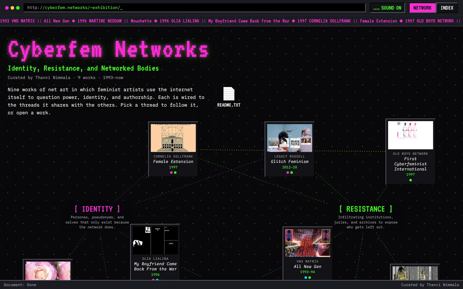
The exhibition as it opens: nine works wired to three threads, under a browser frame with a location bar and a scrolling ticker.
The works
Nine works, one medium, thirty years.
VNS MATRIX — ALL NEW GEN, 1993 TO 1994
A cyberfeminist game from the collective credited with helping coin the word, built around a non-binary protagonist sabotaging a patriarchal system. It is the period evidence that this argument is older than the platforms making it now.
MARTINE NEDDAM — MOUCHETTE, 1996 TO NOW
A website run by a thirteen-year-old girl who is not real, and has not aged in thirty years. It asks the visitor questions, invites replies, and keeps them. Thirty years of other people’s answers are part of the work now.
OLIA LIALINA — MY BOYFRIEND CAME BACK FROM THE WAR, 1996
A hypertext conversation between a couple after a war. Every click splits the browser into smaller frames, so the story fractures as you read it. The HTML frameset becomes the emotional form of the piece.
CORNELIA SOLLFRANK — FEMALE EXTENSION, 1997
Sollfrank invented hundreds of fictitious female artists and submitted their work to a museum’s first net-art competition. Two thirds of the entrants were women; all three prizes went to men. The piece reads the bias straight out of the institution that ran it.
OLD BOYS NETWORK — FIRST CYBERFEMINIST INTERNATIONAL, 1997
The first international cyberfeminist alliance, co-founded by Sollfrank. At documenta X it refused to define cyberfeminism and wrote a hundred anti-theses about what it is not instead.
SHU LEA CHEANG — BRANDON, 1998 TO 1999
The Guggenheim’s first web commission, built around the life and murder of Brandon Teena, a trans man in Nebraska. A multi-author space about gender, the body, surveillance and punishment, still running because the museum migrated its code.
SUBROSA — 1998 TO NOW
A collective working where bodies meet technology and labor: reproductive and genetic technologies, biotech, the information economy. Cyberfeminism as an organised practice, not a style.
LEGACY RUSSELL — GLITCH FEMINISM, 2012 TO 2020
An essay that became a manifesto. The glitch as refusal: a body that will not compute inside the gender binary, and the internet as a place to rehearse and build identity rather than only display it.
MOREHSHIN ALLAHYARI — SHE WHO SEES THE UNKNOWN, 2016 TO 2021
3D-modelled and printed re-figurings of female and queer jinn from Middle Eastern myth, alongside her idea of “digital colonialism” — who gets to scan, own and redistribute a culture’s heritage.
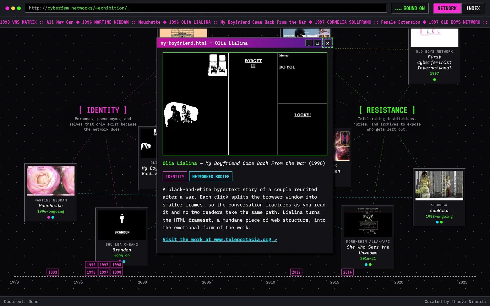
Opening a work opens a draggable window: a screenshot, the wall text, its threads, and a link out to the original.
Curation
The selection is the argument.
Nine works, chosen so that no two make the point the same way: a game, a persona, a hypertext, an intervention in a jury, an alliance, a museum commission, a collective, a manifesto, a set of 3D-printed figures. What they share is dependence — each needs a live network to be itself.
Instead of a chronology, I organised them around three threads that run through the whole field: Identity, Resistance, and Networked Bodies. Most works sit on two, so the connections between them carry as much of the argument as the works do. Sollfrank’s intervention and the alliance she co-founded are wired to each other directly.
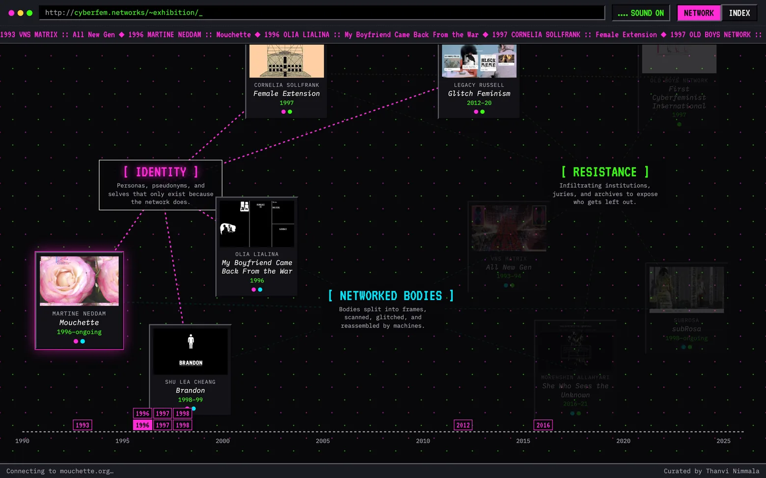
Following the Identity thread: its works light up, everything off it dims.
Ending on Russell and Allahyari is deliberate. It shows the argument is not a 1990s period piece: the same questions moved into social media and 3D-scanned heritage, and they are still open. Two works deal with violence and self-harm, so they carry a content note before you leave for them, and every work links out to the original, still running at its own address, because sending people to the real thing is the point.
The build
The interface had to belong to the work, not to 2025.
A clean contemporary gallery layout would have flattened these pieces into content. So the site is written in the register of the work it shows: a browser frame with a location bar and a status bar, pixel and monospace type, magenta, green and cyan at full saturation on a near-black dotted grid. The curatorial statement is a README.TXT on the desktop.
The structure is the idea. Works are nodes, threads are hubs, and the wires between them are drawn live, so the exhibition’s argument is something you navigate rather than read about. Hovering a work traces its wires and the status bar reports that it is “connecting” to the work’s real address.
It sounds like the period, too. You enter through a dial-up gateway: pressing ENTER plays a modem handshake while a terminal prints the connection log, then the page dissolves into the network. Inside, every work has its own note, so running a cursor across the nodes or down the index plays a scale. Selecting a thread plays an arpeggio of the works on it, and windows open and close with system blips. All of it is synthesized live with the Web Audio API, with no audio files to load.
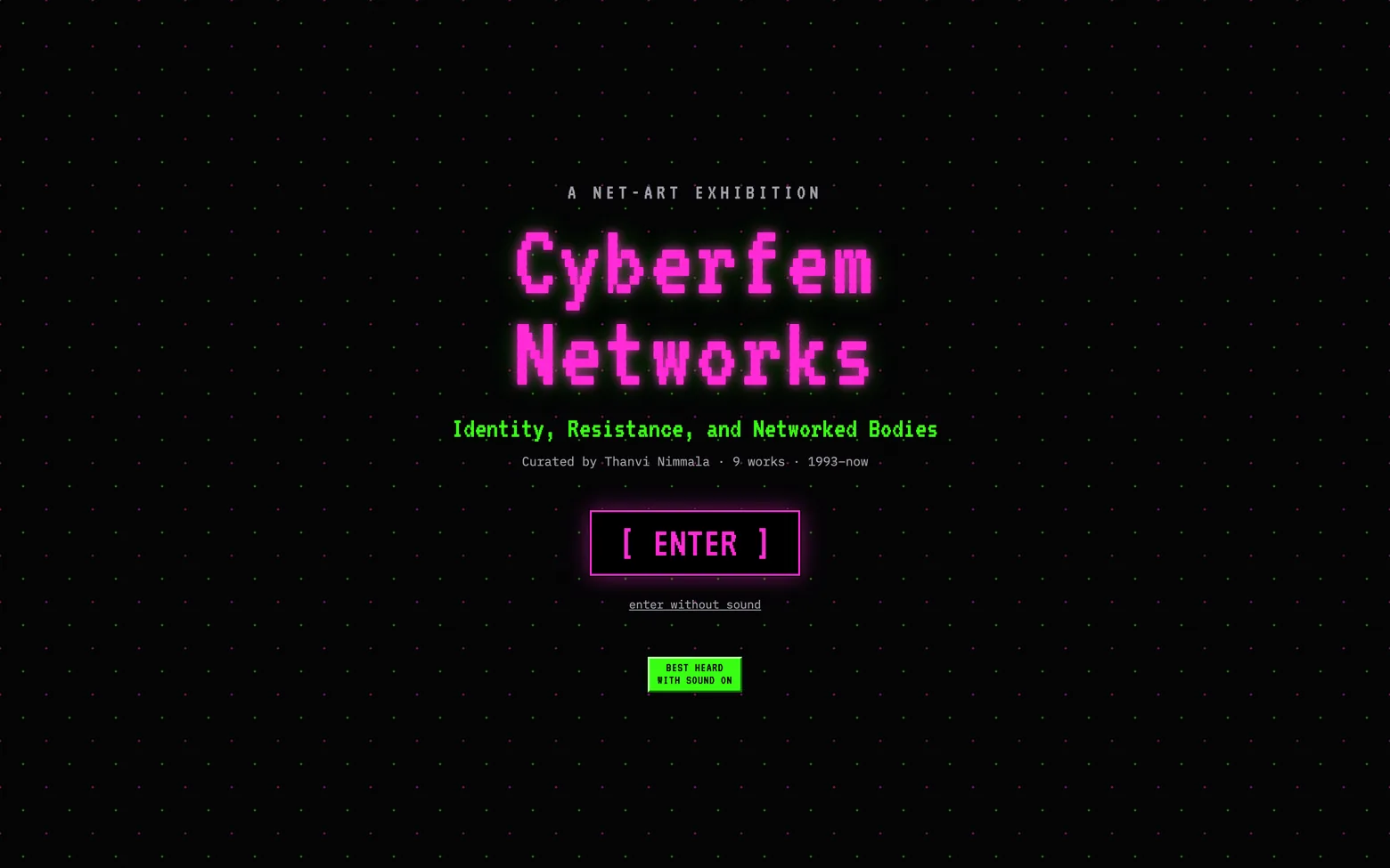
The way in. Browsers will not play sound until a visitor acts, so the ENTER click is both the threshold of the exhibition and the gesture that turns the sound on.
Sound is on by default but never forced: “enter without sound” sits under the button, the choice is remembered, and the gateway only appears once per visit.
An experimental interface cannot be the only way in. A second view lists the same nine works as an early-web directory listing, in date order and readable at a glance, and the threads filter it the same way they filter the network.
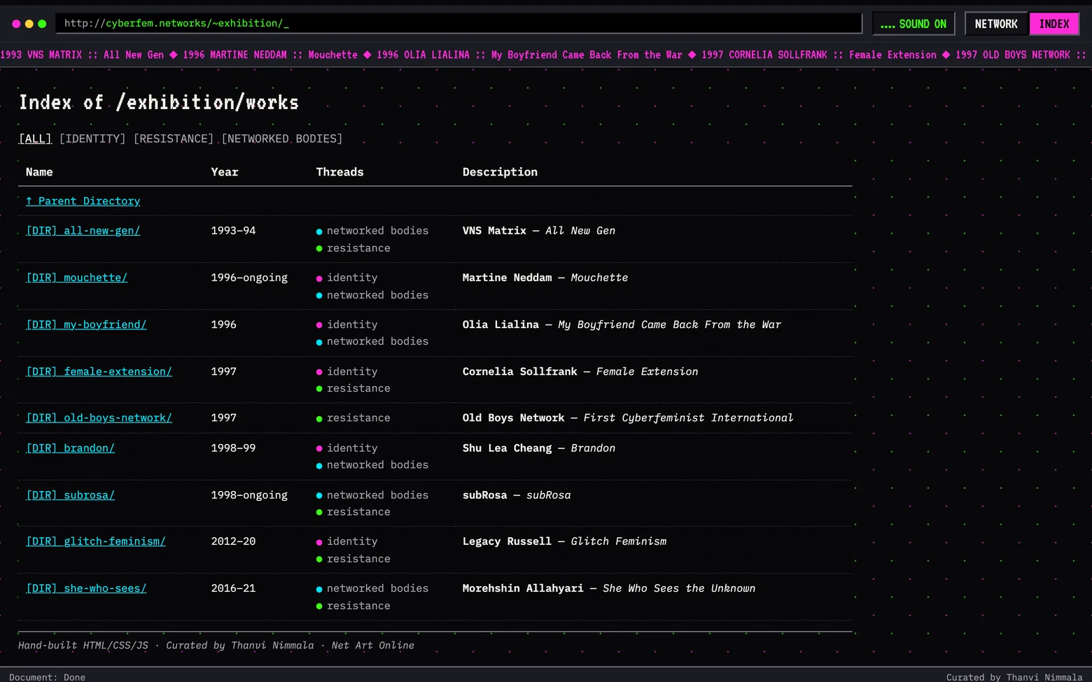
The Index view: the exhibition as a directory listing.
On a phone the network folds into a grid and windows become full-screen sheets. It is hand-written HTML, CSS and JavaScript with no framework and no build step, and adding a work is one entry in a data file. The exhibition should outlive its toolchain, the way the works it shows have outlived theirs.
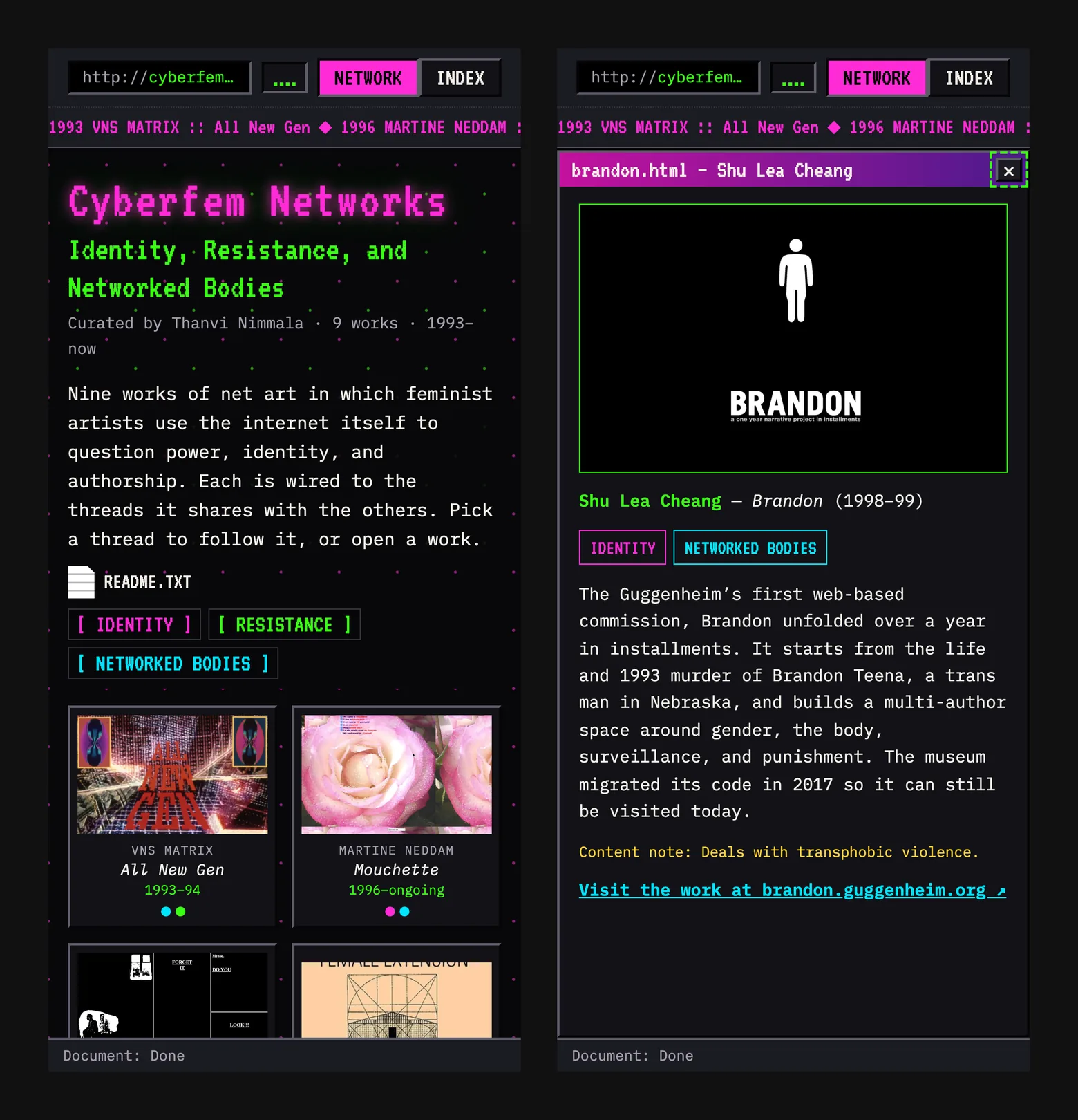
On a phone: the works as a grid, and a work open as a sheet.
Reflection
What I would do differently.
1
Give the network a first path.
A network has no front door. A suggested route — start with one thread, end on the contemporary work — would help first-time visitors who do not know where to click.
2
Screenshots are not the work.
Each window shows a still of something that moves and answers back. Short recordings of each piece in use — answering Mouchette, clicking through Lialina’s frames — would show what the caption can only describe.
3
Let each work pull the page toward its own period.
The early-web treatment is right in principle, but it holds one house style across thirty years. The strongest version would let a 1993 game and a 2020 manifesto each change the room around them.
Up next
The rest of the work.
← All work{{ clock }}
A security model you can read is worth more than one you are told to trust.
When a bank stops a payment you learn two things: that it was stopped, and that you should call someone. You never learn what tripped it. TruePay is a payments app built around an AI fraud model that explains itself — rebuilt as a working front-end shell to test one claim.
Overview
Designing AI into a payment flow came down to transparency, trust and control.
The original concept had the right ingredients — a security score, live alerts, biometric approval, a model watching every transaction — but it spent them on reassurance. Badges telling you that you were safe. That is the same black box in nicer packaging.
So I rebuilt it as a working shell, because the interesting questions here are not answerable in static frames. How much security presence is too much? Does anyone actually read five risk factors, or do they just want the verdict?
Onboarding, home, then a payment sent, screened and approved. The prototype drives itself.
Solutions
Most payments are fine. The design has to believe that.
THE CALM PATH
Ninety-nine times out of a hundred the model has nothing to say, and the screening should cost you nothing but a beat of reassurance. Five steps, one thumb, no interruption — four checks run before the money moves and the user never waits on them.
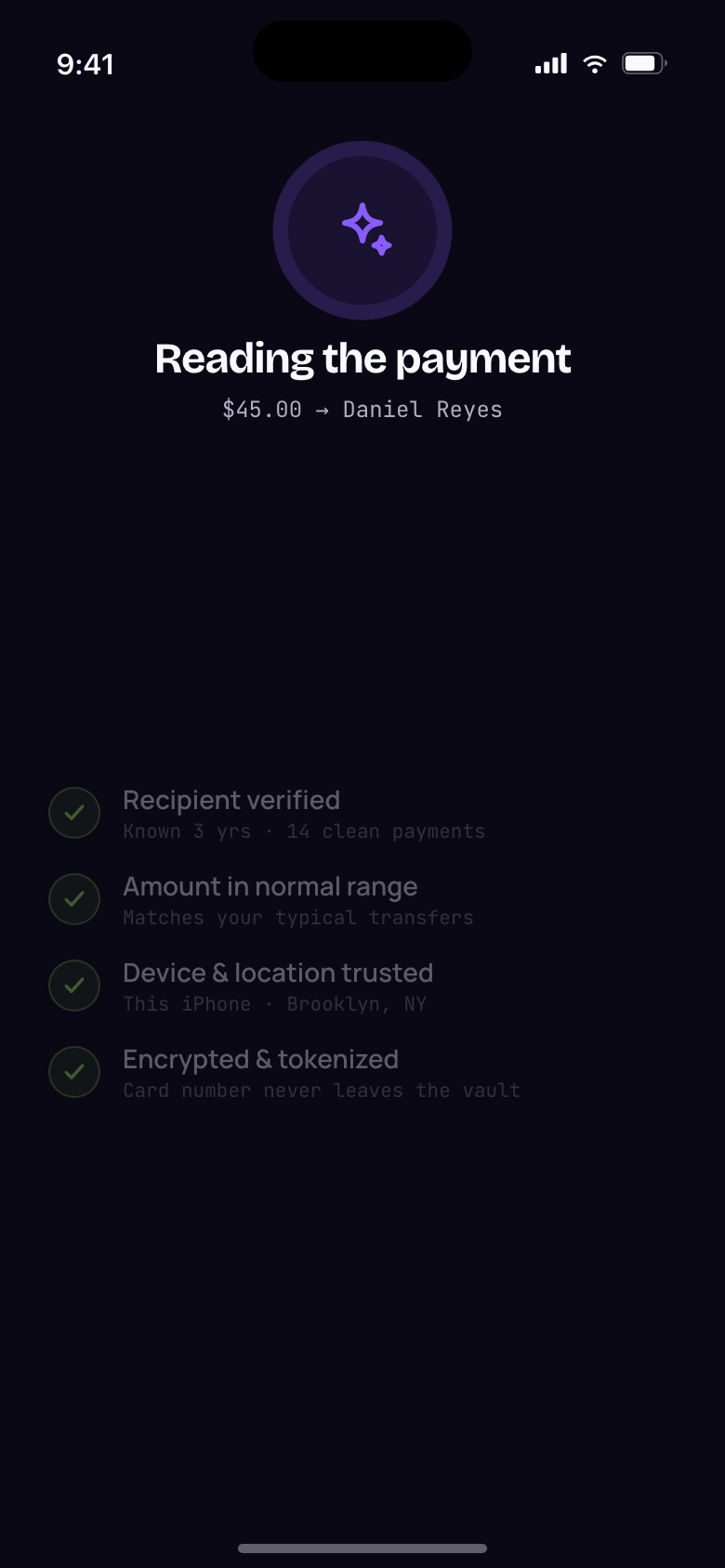
Screened, then approved with Face ID.
READING THE RISK
A held payment normally arrives as a wall of text. But the first question is never why — it is how bad. So the review leads with the shape of the suspicion: five signals on five axes, read in under a second, with confidence as one number in the middle. Only then does the list explain itself, strongest first.
Unknown merchant 94, unusual amount 86, distant origin 62, off-pattern timing 34, device match 12.
THE DECISION
Held is not blocked. The model narrows the choice; it never takes it. Both outcomes sit in a footer pinned to the bottom of the sheet, so however long the signal list runs, the decision stays one thumb-reach away. “Yes, this was me” releases the payment and folds the merchant into what the model trusts. “Not me” freezes the card and says plainly that you are not liable while it is reviewed.
Research
Security you never see is invisible. Security you always see is a checkpoint.
This is the tension the whole product sits on, and I did not want to settle it by argument. So I built visibility as a live variable with three settings and made every screen answer to it.
01
Quiet
Present, but not shouting. No score, no trust block.
02
Default
As it ships: score in the header, trust block in the feed.
03
Foregrounded
Something needs attention, so narration takes the top.
Default is what the build ships with — enough that the model is visibly working, quiet enough that it is not asking for credit. Foregrounded earns its place right after a hold, when narration is genuinely wanted, and nowhere else.
Calm, screening, held, cleared — a drifting field behind every screen, always paired with text, an icon and a token.
Process
A number you cannot move is decoration.
Trust scores in finance apps are handed down, with no visible relationship to anything you control. Here the score is the sum of six protection weights: switch one off and it recalculates in front of you.
The visual had to be able to degrade, which ruled out a progress ring — a ring at 42% looks like a ring at 96%, only shorter. Instead the score is 72 ticks riding a standing wave, with a second, rougher harmonic that scales with how much cover you have lost. A weakened score does not merely shrink. It visibly frays.
Protections come off, the wave frays, then they go back on.
Engineering
A fix I only found because the prototype was real enough to scroll.
The first build let the decision buttons sit at the end of the content. On a 390-point screen the signal list pushed them below the fold — the single most important control in the product, reachable only by scrolling past every reason to distrust it.
Sticky footer, gradient fade, problem gone. Both outcomes now sit pinned to the bottom of the sheet, so however long the signal list runs, the decision stays one thumb-reach away. That is the argument for building the thing: in a static frame this screen looks finished.
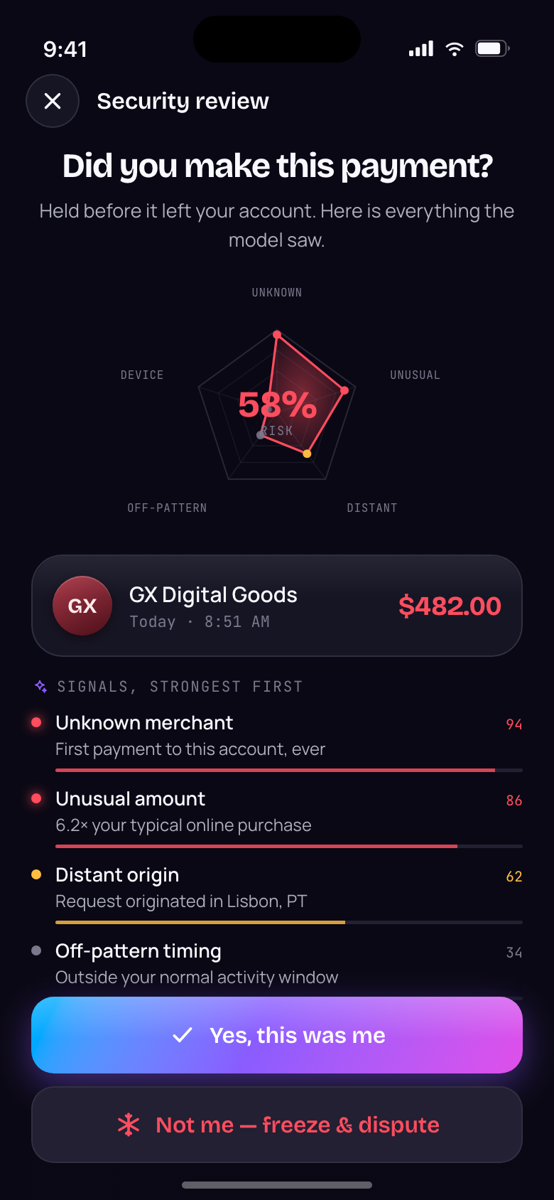
The held payment, with the decision pinned under the signals.
The prototype
Eleven screens, all navigable — a shell, not a clickthrough.
Three onboarding beats, four tabs and four overlay flows, every one of them reachable by arrow key. I built it in React so the questions this project asks — how much security presence is too much, does anyone read five risk factors — could be answered by using it rather than by arguing about a frame.
EVERY COLOUR AND CORNER IS ONE TOKEN AWAY
The build ships with its own control panel. Accent, corner radius, type pairing and AI presence are live, and each writes a CSS custom property the whole app reads — no component holds a literal colour or radius. It exists so a design review can change the argument mid-sentence instead of asking for another round of comps.
The stage: scene rail, device, and the live token panel.
WHAT THE SHELL MADE POSSIBLE
01
Autoplay, for people who will not click
Seven scripted reels drive the prototype hands-free — a synthetic pointer travels to each control, taps it, and a caption narrates underneath.
02
Built to be recorded
At a viewport around 945 points tall the device renders at exactly 390 × 844, so a retina capture comes out at clean 2× pixels with no resampling. A record mode strips the stage chrome. The prototype is its own asset pipeline — every reel on this page came out of it.
03
Cards as objects, not rows
A physical card, a merchant-locked virtual number and a business card, each with its own freeze switch and spend meter, drawn with the same banknote line-work as the balance.
The three cards, and the freeze switch.
Validation
What the build proved, and what it only claims.
The insight that stuck: people will accept almost any safeguard if you tell them why it is there, and resent the smallest one if you do not. Every decision in this build follows from that — the radar, the ambient field, the score you can move, the decision that never leaves the screen.
11
Screens, all navigable — a shell, not a clickthrough.
5
Signals behind every hold, each one weighted and shown.
0
Red walls. Every stop comes with its reasons and both outcomes.
Reflection
What it has not earned yet.
1
Does the radar actually read?
I believe the silhouette is faster than a list. That is a hypothesis, and it needs five people and a stopwatch, not my confidence.
2
The ambient field needs an accessibility pass.
State is carried by colour, icon and text together — but I have not tested it with a screen reader, or at reduced motion beyond honouring the media query.
3
The watching verdict needs a home.
Recurring subscriptions sit between cleared and held, and that middle verdict currently only appears as a badge. It deserves a surface.
4
Business mode is a switch, not a flow.
Dual approval over a threshold is stated in the profile and implemented nowhere. It is the obvious next build.
Up next